As part of my 10-week journey as a UXDI apprentice, I was tasked with redesigning the e-commerce experience for a local business based on the needs of a specific buyer persona.
Overview
TITLE: Concept 47 E-Commerce Redesign
GOAL: Increase online sales for Concept 47 by catering to the needs of careful buyers
DURATION: 2 Weeks
MY ROLE: User Research, UX/UI Design, Prototyping/Wireframing, Usability Testing
The Persona: Careful Critic
Based on Concept 47’s location and offerings, I chose to focus on buyers who value quality products and tend to take their time when making purchase decisions.
The Business: Concept 47
Concept 47 is an Oakland-based gift shop that sources natural body products, handmade jewelry, and home goods from local artisans.
How might we help our users navigate Concept 47, and easily take action on purchasing products online?
RESEARCH
Heuristic Review
There needed to be a more efficient way to navigate Concept 47’s e-commerce website to find products a user is looking for because of inconsistencies in the destination of links. The website’s homepage contained three different menu options which made hyperlinks redundant and even contained ones that did not lead to any merchandise at all. This is an issue that lead customers to be more comfortable purchasing products in store than online.
Competitive & Comparative Data Analysis
First, I gathered competitive and comparative data to uncover insights on Concept 47’s strengths and areas for improvement.
I analyzed e-commerce sites such as BLK&GRN and Uncommon Goods because both companies sell similar goods and/or products like Concept 47. BLK&GRN is a more direct, local competitor while Uncommon Goods is a regional retailer.
Card Sorting
Conducting an open and closed card sort was next. The users who participated in the open card sort created detailed pages for links and even added a “website elements” section for things they thought should be on all pages. Users who participated in the closed card sort had a skewed idea of what should go where and was unable to match links to pages completely based on the current IA’s state.
IA & Sitemap Redesign
In the original information architecture, themes are redundant and contain the same or similar products in a handful of categories. I then redesigned the IA to fit user results more coherently. Pages that didn’t consist of any products or information were removed as users should not be able to come across a blank page.
Concept 47’s original sitemap had too many interlinked pages that either matched or opened a whole new link; which also consisted of the three navigation menus that can be confusing to a user. My reorganized sitemap is coordinated into three levels (primary, secondary, and tertiary) with relevant product pages.
This straightforward design helps guide the user to adequately browse and choose a specific product.
Paper Prototypes
Paper prototypes were constructed with lo-fi layered blocking and then later with preliminary page blocks to make navigation clearer when conducting a user test.
User Journey & Logical Flow
I then created a user journey and logical flow to determine how a user will complete protocols within the usability tests. I round up two users to complete three tasks to calculate the system usability score, or SUS, for the redesigned website which will determine if it is applicable enough to go live.
The following tasks were to be completed:
Find a facial mask and add it to your Cart
View Cart and purchase item
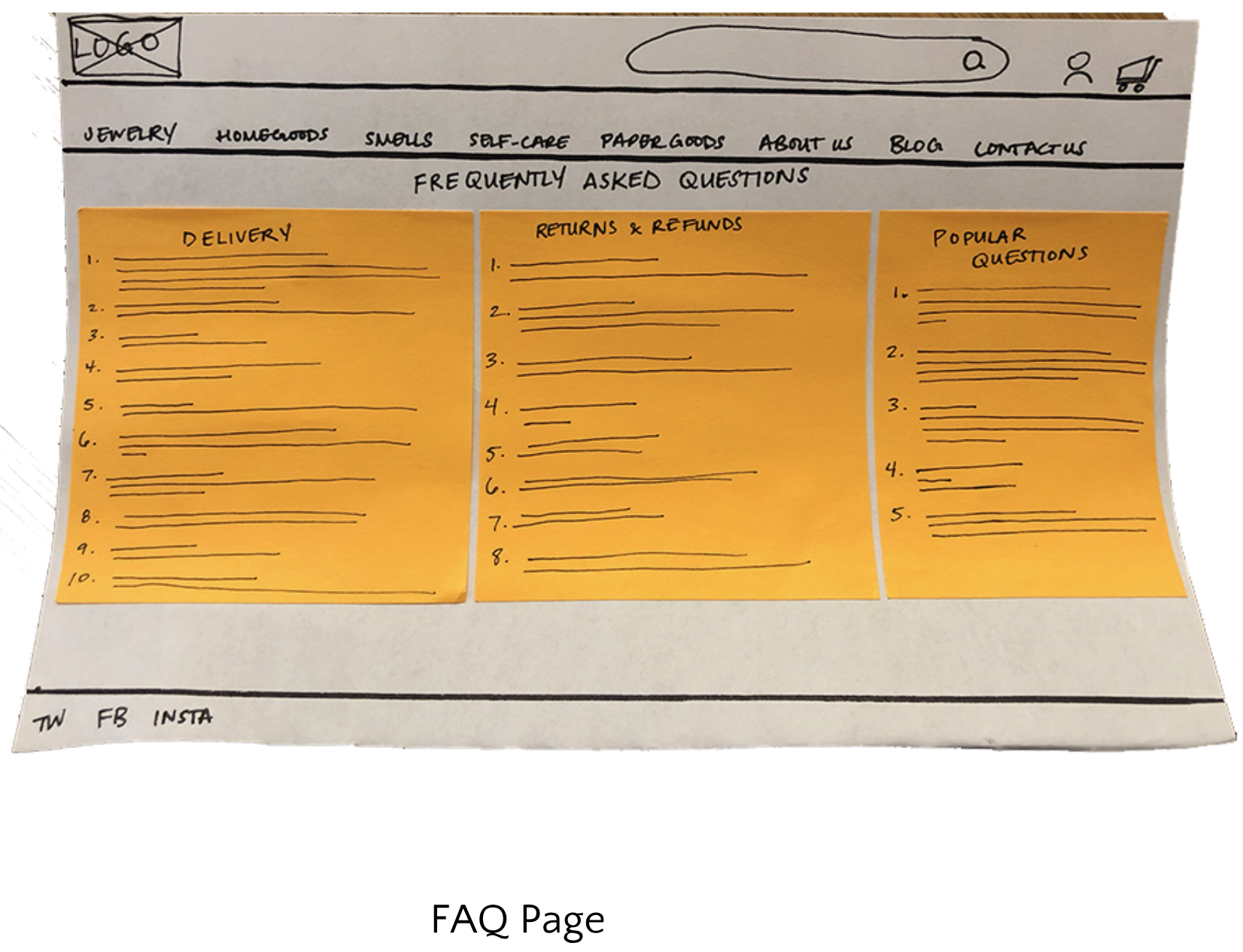
Find information about Returns and Refunds
Usability Testing & Results
Both users had trouble finding the FAQ page due to familiarity with it being in the footer section of a website. However, they both eventually found it under “Contact Us” and was satisfied with why it would be there instead. The results of the tests were both passing scores of 97.5 and 95 which is above the 80 SUS score average. My redesign proved to make Concept 47’s e-commerce website to be easily maneuvered and a brisk experience.
Key Takeaways & Next Steps
Although there are a few more tweaks that can be adjusted to make the website more enjoyable for the persona, these improvements helped the user accomplish their online shopping goals. The next steps would be to include an in-depth ratings and reviews section to help the users buying experience more satisfactory.
If this solution were to go live, I believe that its performance would increase online traffic and e-commerce sales amongst users who were able to make a confident purchase decision. The improvements make Concept 47’s e-commerce site more organized and user needs easily accessible.


